Five logos defining rock and pop artists
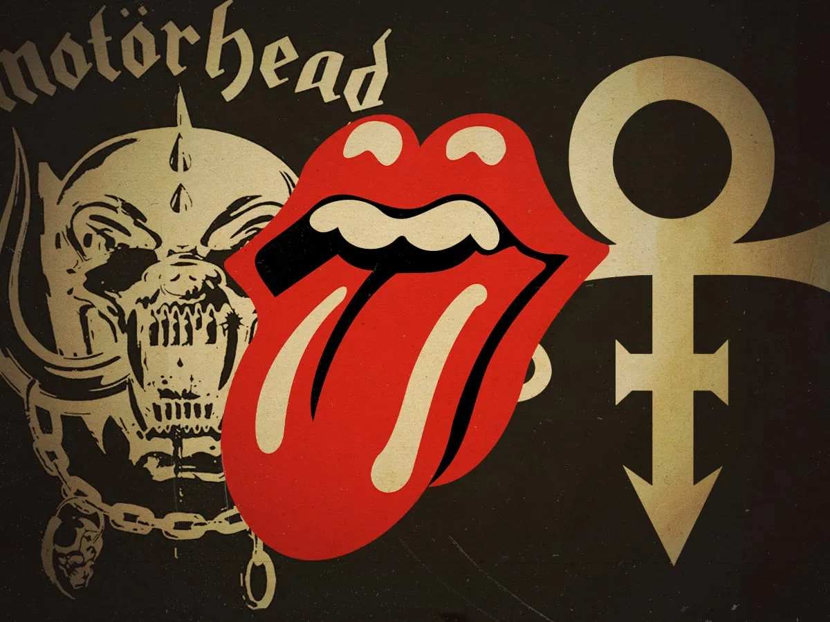
In the world of rock and pop, it’s easy to let loose a cracking font or a stylized graphic for a band name. But to achieve true immortality, an image alone is the ultimate feat.
An enduring image floating around the rock and pop canon is a sign that an act’s essence has been captured. That’s the magic of a symbol: it bottles both spirit and intrigue. From the rudimentary pictograms carved into cave walls before writing existed, an effective image needed to convey an immediately accessible meaning, whether for instruction or ritual.
Today, the need for overt meaning has lessened, but bottling that same blend of spirit and intrigue in a band’s design has evolved into a potent art form. There is plenty to sift through when looking at the visual identities that have truly stood the test of time.
We are looking at five artists who have immortalized themselves with a logo that stands alongside their name, or even supplants it, creating visual legends that are impossible to ignore.
The Visual Pantheon: Five Artists Defined by Their Logos
First up is Einstürzende Neubauten. While orbiting the Berlin post-punk underground, the collective managed to guide their industrial racket nearly 50 years later. They travelled an eclectic road, moving beyond mere scrapyard clangour to more brittle conjurings of metallic ambience. Yet, a foundational anchor has guided their creative shifts: a symbol plucked from ancient history. This is the Toltec petroglyph, discovered in Mexico’s Chilpancingo dating back as early as 700 AD. Frontman Blixa Bargeld sought out a symbol that initially meant nothing, allowing it to be filled with meaning. This simple, ancient shape continues to represent the experimental band, appearing on their debut, Kollaps, and remaining their defining motif.
Next, there is Motörhead, the epitome of raw, relentless energy. Before their success, heavy metal pioneer Ian ‘Lemmy’ Kilmister wanted a different name, but the result—Motörhead—became legendary. The name was adopted partly to avoid commercial oblivion and partly to nod to Lemmy’s speedfreak taste. The addition of an umlaut also lent the name a certain mean edge. The identity was cemented by an equally arresting symbol, dreamt up by American artist Joe Petagno in 1977. Petagno envisioned a cross-breed gorilla-wolf-dog combination with oversized boar’s horns. Lemmy added helmet, chains, and grit, forging an immortal mascot that perfectly captured the band’s full-throttle speed metal barrage.
The ethereal and enigmatic Radiohead proved that visual mystery is potent branding. The band’s emblem, the wide-eyed, sharp-toothed genetic bears known as the ‘Mod Bears’, initially sprang from a bedtime story told by longtime artist Stanley Donwood. It found life in the 2000 comic Test Specimens, depicting the bears bringing about the end times in a mischievous way. The ‘Mod Bears’ arrived at a perfect moment for Radiohead, allowing them to retreat from the public eye and let Donwood’s art direction promote their reinvention. Though never overtly on album covers, these geometric, gnashing ursines have since become Radiohead’s de facto insignia, adorning countless merchandise and remaining their default visual motif.
The flamboyant Prince masterfully used his personal symbol to create a legend. As a superstar in the 1990s, while recording tirelessly at Paisley Park, he faced the pressure of the music industry. To protest Warner Bros’ attempts to control his dizzying creativity, Prince adopted his trademarked “Love Symbol #2” as his official stage name. This symbol, a cross between male and female glyphs, served as his ultimate ‘fuck you’ to the label until he finally shed his contract in 1996. It remains a powerful testament to artistic defiance.
Finally, there is the timeless icon, The Rolling Stones. The logo is perhaps the most famous in all of rock and roll. Deployed as a backdrop for live shows, emblazoned on a million T-shirts, and even featuring on the side of the official touring Boeing 767, the Stones’s tongue-and-lips smacker has been a visual fixture since the band’s golden age. Designer John Pasche, approached by Mick Jagger, fashioned the motif by taking cues from the Hindu goddess Kali, resulting in plump lips and a giant tongue that perfectly bottled the band’s raunchy and sexually alluring presence. This enduring piece of pop culture art is set to outlive the band as a 20th-century icon long after they have passed from living memory.
Buy on Amazon
Credit
